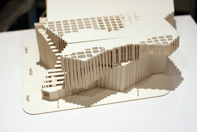
This is a small project for an art
Design Concepts
Getting an inspiration from the repetition of lines from Solve Sundsbo's photos and the form of a pile of fashion magazines, the overall form and three facades have a sense of rhythm and movement and bring people a strong visual impact. It makes this building in an outstanding position in King St. The concave area and protruding area of facades are centrosymmetric. It creates a sense of balance. The light curtain wall and repetition of lines make this concrete building not so heavy.
In addition, the repetition of lines and faces are easy to manipulate the illumination design. There are six perpendicular glass panels on the main facade, which reveals the small gallery on the 2rd floor to tell people this is an gallery and provide plenty of light to the main staircase of this gallery. The photo exhibition mainly needs artificial light to get better quality so I only use side light coming from very high level( the space takes two levels height) which can not directly lit on the photographs. A large area opening is provides to the bedroom, reading room, living room and playroom on the 3rd floor for private use. For the courtyard, visitors may get tired after watch lots of photographs in semi-closed area so I design an open courtyard on the 3rd floor to let visitors take a fresh breath and have a drink outside.
Program
The public gallery spaces are set on the 1st and 2rd floor. The stockroom is set in the rear part on the 1st floor in order to let the convey of art works conveniently. The office and workshop are also on the side part on 1st floor with two toilets. The apartment space for art dealer is on the 3rd floor to get maximun private. The living area with kitchen facility is also on the third floor.
Circulation
The front staircase and rear lift form virtical loops of circulation and corridors form horizontal loops of circulation. They ganrantees the continuity of movement in this building.
The example of circulation for visitors:
front main access->1st floor main exhibition area -> 2rd floor small exhibition area->3rd floor living are and outside courtyard->take a lift back to 1st floor
The example of circulation for art dealers:
2. rear access-> take a lift to 3rd floor apartment


